FLYING BROOM
Re-Branding projects
The festival was created to provide a platform for female filmmakers from around the world to showcase their work and to promote gender equality in the film industry. It features a wide range of films, including documentaries, shorts, and feature-length films, all of which are directed or co-directed by women. The festival also hosts workshops, seminars, and panels that focus on women’s issues and the role of women in the film industry.
ASSESSMENT
Photoshop, Illustrator
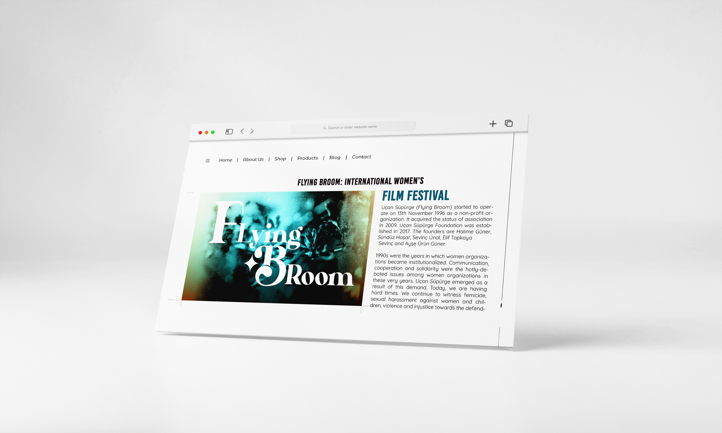
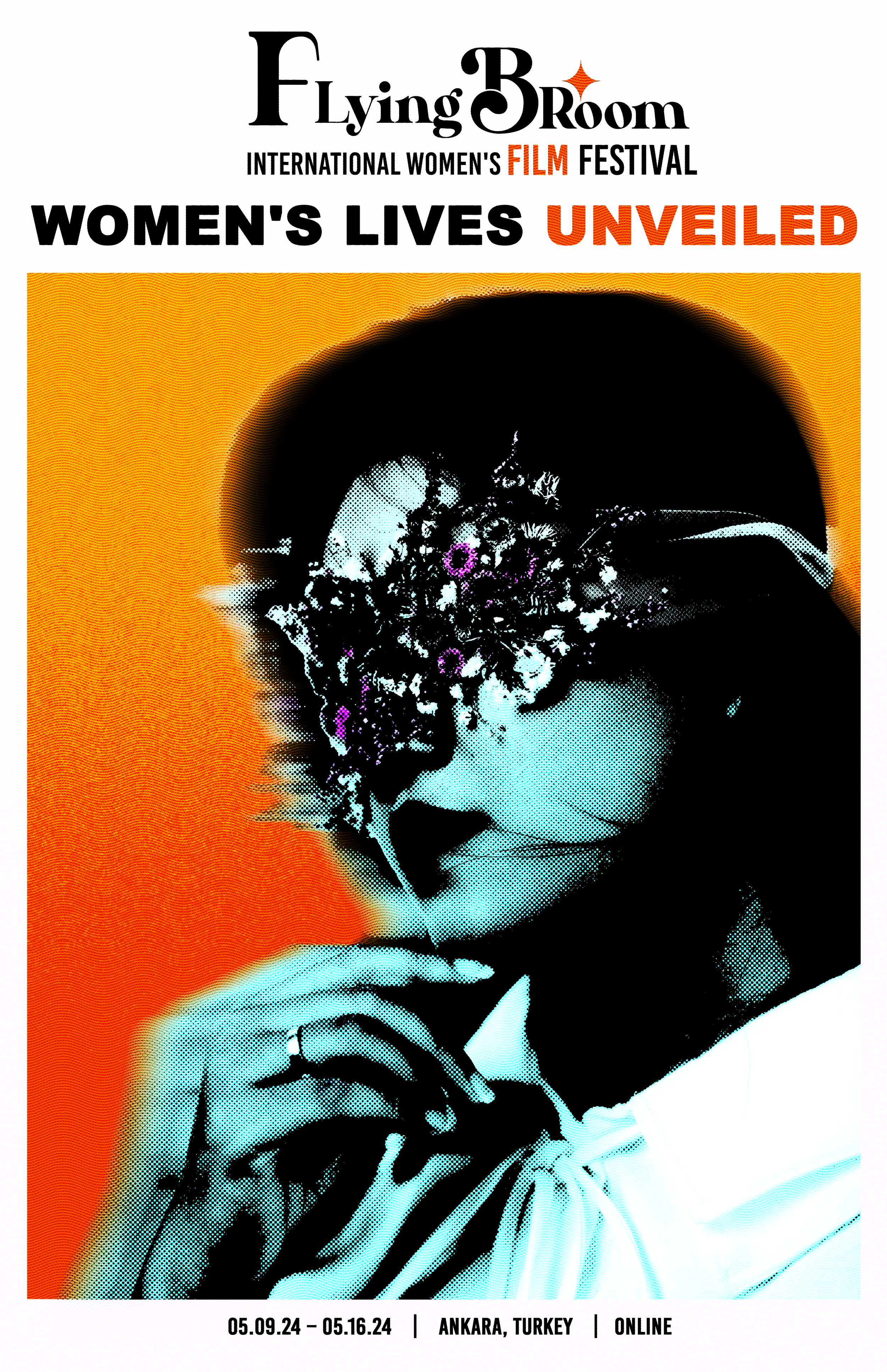
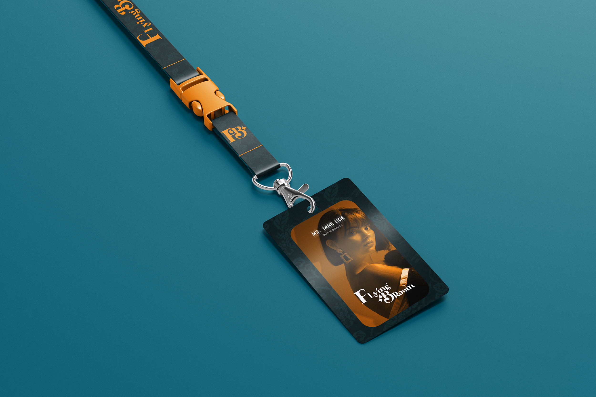
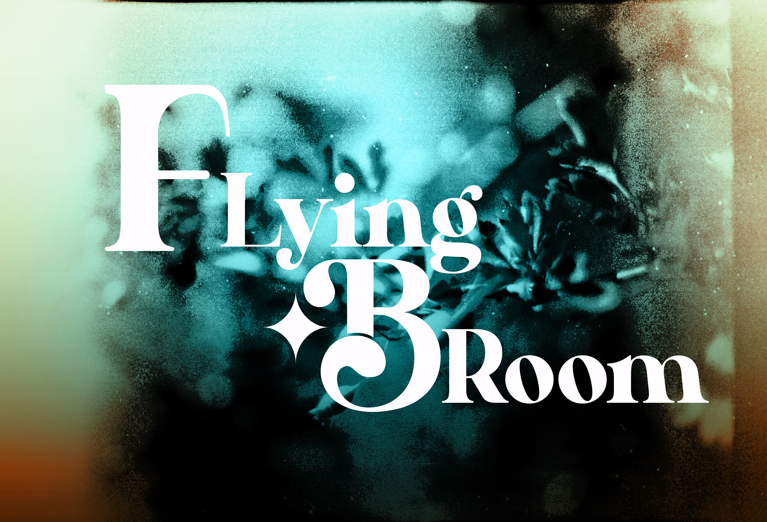
The Flying Broom Film Festival is re-branded to give the brand a refreshing look and present a more cohesive aesthetic to represent its mission of female-centric struggles and supporting female artists. The Logo draws inspiration from the original witch theme of the brand while utilizing playful colors to represent a modern look. The Primary brand colors here are teal, to represent the deep struggles women have faced, Orange to represent new hope and a pop of color, off-White to create a balance between the brand, and Black to add a touch of Sophistication.
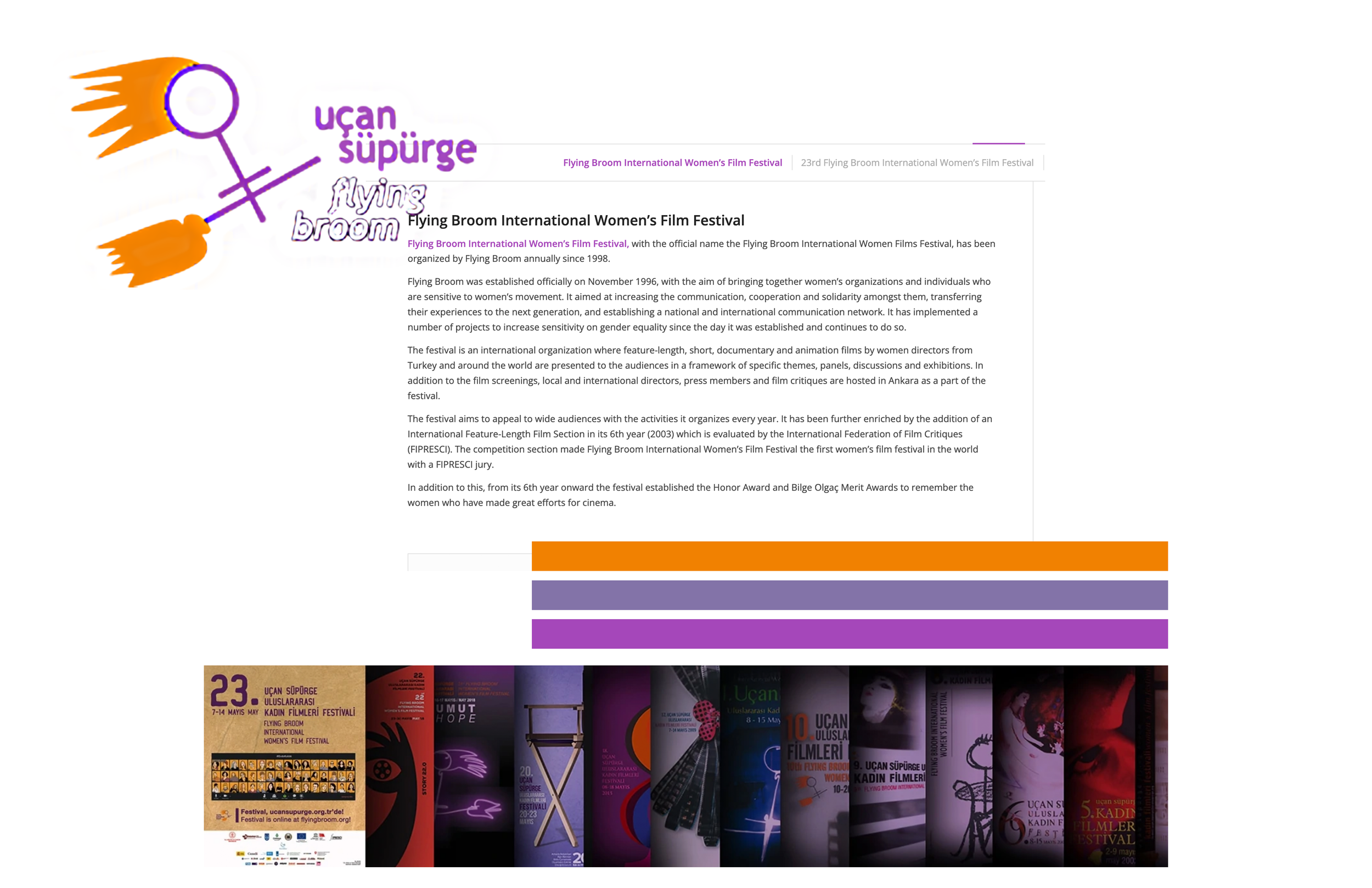
OLD BRANDING
REVISIONED BRANDING

